libGDX 2D UI Library - Widgets
概要
libGDX の 2D UI Library のうち、Button 系以外の Widget についてまとめます。
目次
確認環境
- OS X El Capitan (10.11.6)
- Xcode 8.0
- Android Studio 2.2.2
- Multi-OS Engine Plugin 1.2.1
- Kotlin 1.0.4
- buildToolVersion 25.0.0
- compileSdkVersion 24
- libGDX 1.9.5-SNAPSHOT
参考情報
- Scene2d · libgdx/libgdx Wiki · GitHub
- Scene2d 公式文書。
- Viewports · libgdx/libgdx Wiki · GitHub
- Viewport 公式文書。
- Scene2d.ui · libgdx/libgdx Wiki · GitHub
- Scene2d UI 公式文書。
- libGDXの基礎5 Scene2Dを使う - Qiita
- 概要。
解説
Image
| 設定項目 | 型 | 説明 |
|---|---|---|
| drawable | Drawable | 描画対象 |
| Skin, String | ||
| NinePatch | ||
| Texture | ||
| TextureRegion | ||
| scaling | Scaling | Scaling.none, Scaling.fit, Scaling.fill, Scaling.stretch (default)。(fill, stretch には X, Y のみがある。) |
| align | Int | Align.topLeft, Align.top, Align.topRight, Align.right, Align.bottomRight, Align.bottom, Align.bottomLeft, Align.left, Align.center (default)。 |
サイズ
| min | pref | max | |
|---|---|---|---|
| width/height | 0 | drawable のサイズ | 0 |
Scaling (align = Align.center の場合)

| Scaling.none | Scaling.fit |
|---|---|
 |
 |
| Scaling.fill | Scaling.stretch |
 |
 |
サンプルコード
    private val actor by lazy {
        Image(Texture("badlogic.jpg")).apply {
            width = this@MyGdxGame.stage.width
            height = this@MyGdxGame.stage.height
            setScaling(Scaling.none)
            //setScaling(Scaling.fit)
            //setScaling(Scaling.fill)
            //setScaling(Scaling.stretch)
            setAlign(Align.center)
        }
    }

    override fun create() {
        ...
        stage.addActor(actor)
    }
Label
| 設定項目 | 型 | 説明 |
|---|---|---|
| text | CharSequence | 描画対象。改行文字 ('\n') で改行される。 |
| style | Label.LabelStyle | background, font, fontColor |
| Skin | ||
| labelAlign | Int | Label 全体の配置。Align.topLeft, Align.top, Align.topRight, Align.right, Align.bottomRight, Align.bottom, Align.bottomLeft, Align.left (default), Align.center。 |
| lineAlign | Int | 各行の配置。Align.left (default), Align.center, Align.right。 |
| ellipsis | Boolean | true ならば width を超えないように末尾を "..." に置き換える。(default: false) |
| String | null 以外ならば width を超えないように末尾を指定した String に置き換える。 | |
| fontScaleX | Float | X 方向の拡大率。 |
| fontScaleY | Float | Y 方向の拡大率。 |
| wrap | Boolean | true ならば width を超える場合に改行する。ellipsis が優先される。(default: false) |
サイズ
| min | pref | max | |
|---|---|---|---|
| width/height | prefと同じ | text が収まるサイズを算出 | 0 |
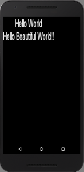
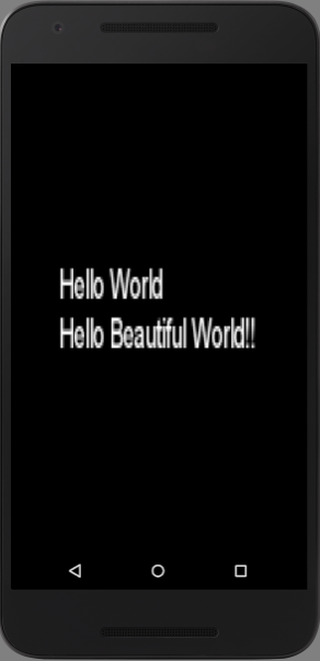
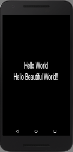
text = "Hello World\nHello Beautiful World!!"、fontScaleX = 5、fontScaleY = 10 の場合の表示例。
| labelAlign = topLeft, lineAlign = center | labelAlign = center, lineAlign = center | labelAlign = bottomRight, lineAlign = center |
|---|---|---|
 |
 |
 |
| labelAlign = center, lineAlign = left | labelAlign = center, lineAlign = center | labelAlign = center, lineAlign = right |
|---|---|---|
 |
 |
 |
サンプルコード
    private val actor by lazy {
        Label("Hello World\nHello Beautiful World!!",
                Label.LabelStyle(BitmapFont(), Color.WHITE)).apply {
            width = this@MyGdxGame.stage.width
            height = this@MyGdxGame.stage.height
            setFontScale(5f, 10f)
            setAlignment(Align.center, Align.center)
        }
    }

    override fun create() {
        ...
        stage.addActor(actor)
    }
TextField
| 設定項目 | 型 | 説明 |
|---|---|---|
| text | String | 入力欄に設定される文字列。改行文字 ('\n') は除去される。 |
| style | TextField.TextFieldStyle | BitmapFont (font, messageFont), Color (fontColor, messageFontColor, disabledFontColor, focusedFontColor), Drawable (background, disabledBackground, focusedBackground, cursor, selection) |
| Skin | ||
| alignment | Int | Align.left, Align.center, Align.right。 |
| maxLength | Int | 入力可能文字数。 |
| messageText | String | text 未入力時に表示する文字列。入力を削除しても再表示されない。 |
| onlyFontChars | Boolean | true (default) ならば、text に set する際に BitmapFont に含まれない文字を除去する。false ならば、含まれない文字を空白に置き換える。 |
| passwordMode | Boolean | true ならば、入力文字列を passwordCharacter で表示する。false (default) ならば、入力文字列をそのまま表示する。 |
| passwordCharacter | Char | passwordMode が true のときに使用する文字。設定しないと passwordMode = true でもマスクされない。 |
サイズ
| min | pref | max | |
|---|---|---|---|
| width/height | prefと同じ | ? | 0 |
サンプルコード
    private val actor by lazy {
        TextField("", TextField.TextFieldStyle().apply {
            font = BitmapFont().apply {
                data.scale(10f)
            }
            messageFont = font
            fontColor = Color.WHITE
            messageFontColor = Color.RED
        }).apply {
            width = this@MyGdxGame.stage.width
            height = this@MyGdxGame.stage.height
            maxLength = 10
            messageText = "message"
            isPasswordMode = false
            setPasswordCharacter('x')
            setAlignment(Align.right)
            setOnlyFontChars(false)
            //text = "aとbとc"
        }
    }

    override fun create() {
        ...
        stage.addActor(actor)
    }
TextArea
TextField と同様。 異なる点は text に改行文字を含むことができ、width を超える場合には改行して表示される。
List
| 設定項目 | 型 | 説明 |
|---|---|---|
| items | Array |
リストの項目。文字列として表示される。 |
| style | List.ListStyle | BitmapFont (font), Color (fontColorSelected, fontColorUnselected), Drawable (background, selection) |
| Skin |
サイズ
| min | pref | max | |
|---|---|---|---|
| width/height | prefと同じ | ? | 0 |
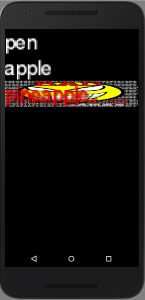
実行例
サンプルコード
    private val actor by lazy {
        List<String>(List.ListStyle().apply {
            font = BitmapFont().apply {
                data.scale(10f)
            }
            fontColorUnselected = Color.WHITE
            fontColorSelected = Color.RED
            selection = SpriteDrawable(Sprite(Texture("badlogic.jpg")))
        }).apply {
            width = this@MyGdxGame.stage.width
            height = this@MyGdxGame.stage.height
            setItems("pen", "apple", "pineapple")
        }
    }

    override fun create() {
        ...
        stage.addActor(actor)
    }
SelectBox
| 設定項目 | 型 | 説明 |
|---|---|---|
| items | Array |
リストの項目。文字列として表示される。 |
| style | SelectBox.SelectBoxStyle | BitmapFont (font), Color (fontColor, disabledFontColor), Drawable (background, backgroundOpen, backgroundOver, backgroundDisabled), List.ListStyle (BitmapFont (font), Color (fontColorSelected, fontColorUnselected), Drawable (background, selection)), ScrollPane.ScrollPaneStyle (Drawable (background, corner, hScroll, hScrollKnob, vScroll, vScrollKnob)) |
| Skin | ||
| maxListCount | Int | ドロップダウン時に表示する項目数。(default: items の要素数) |
| scrollingDisabled | Boolean | true ならば、ドロップダウン時のスクロールを無効にする (maxListCount の個数しか表示されない)。false (default) ならば、有効にする。 |
サイズ
| min | pref | max | |
|---|---|---|---|
| width/height | prefと同じ | ? | 0 |
実行例
| default | maxListCount = 3 | maxListCount = 3, scrollingDisabled = true |
|---|---|---|
 |
 |
 |
サンプルコード
    private val actor by lazy {
        val commonFont = BitmapFont().apply {
            data.scale(10f)
        }
        SelectBox<String>(SelectBox.SelectBoxStyle().apply {
            font = commonFont
            fontColor = Color.WHITE
            background = SpriteDrawable(Sprite(Texture("badlogic.jpg")).apply {
                color = Color.YELLOW
            })
            backgroundOpen = SpriteDrawable(Sprite(Texture("badlogic.jpg")).apply {
                color = Color.GRAY
            })
            listStyle = List.ListStyle().apply {
                font = commonFont
                fontColor = Color.GRAY
                fontColorUnselected = Color.GREEN
                fontColorSelected = Color.RED
                selection = SpriteDrawable(Sprite(Texture("badlogic.jpg")).apply {
                    color = Color.RED
                })
            }
            scrollStyle = ScrollPane.ScrollPaneStyle().apply {
                vScroll = SpriteDrawable(Sprite(Texture("badlogic.jpg")).apply {
                    color = Color.BLUE
                })
                vScrollKnob = SpriteDrawable(Sprite(Texture("badlogic.jpg")).apply {
                    color = Color.MAGENTA
                })
            }
        }).apply {
            val stageW = this@MyGdxGame.stage.width
            val stageH = this@MyGdxGame.stage.height
            setPosition(stageW/2 - width/2, stageH - height)
            setItems("1", "2", "3", "4", "5", "6", "7", "8", "9", "0")
            //maxListCount = 3
            //setScrollingDisabled(true)
        }
    }

    override fun create() {
        ...
        stage.addActor(actor)
    }
ProgressBar
| 設定項目 | 型 | 説明 |
|---|---|---|
| min | Float | 最小値。 |
| max | Float | 最大値。 |
| stepSize | Float | 最小値から最大値を分割したときの一区画のサイズ。value は近くの区画に丸められる。 |
| vertical | Boolean | true ならば、縦方向に表示。false ならば、横方向に表示。 |
| style | ProgressBar.ProgressBarStyle | Drawable (background, knob, knobBefore, knobAfter, disabledBackground, disabledKnob, disabledKnobBefore, disabledKnobAfter) |
| Skin | ||
| visualInterpolation | Interpolation | value に set して、表示が更新される際のアニメーション表示方法。 |
| animateDuration | Float | アニメーション時間。単位は秒。 |
| animateInterpolation | Interpolation | setAnimationDuration を実行した際に行われるアニメーションの表示方法。 |
サイズ
| min | pref | max | |
|---|---|---|---|
| width/height | prefと同じ | ? | 0 |
実行例
| vertical = false | vertical = true |
|---|---|
 |
 |
サンプルコード
    private val actor by lazy {
        ProgressBar(0f, 100f, 25f, false,
                ProgressBar.ProgressBarStyle().apply {
                    background = SpriteDrawable(Sprite(Texture("badlogic.jpg")).apply {
                        color = Color.WHITE
                    })
                    knob = SpriteDrawable(Sprite(Texture("badlogic.jpg")).apply {
                        color = Color.BLUE
                    })
                    knobBefore = SpriteDrawable(Sprite(Texture("badlogic.jpg")).apply {
                        color = Color.RED
                    })
                    knobAfter = SpriteDrawable(Sprite(Texture("badlogic.jpg")).apply {
                        color = Color.GREEN
                    })
                }
        ).apply {
            width = this@MyGdxGame.stage.width
            height = this@MyGdxGame.stage.height
            setVisualInterpolation(Interpolation.fade)
            setAnimateDuration(10f)
            value = 60f
            setAnimateInterpolation(Interpolation.bounce)
            setAnimateDuration(20f)
        }
    }

    override fun create() {
        ...
        stage.addActor(actor)
    }
Slider
ProgressBar のサブクラス。
| 設定項目 | 型 | 説明 |
|---|---|---|
| min | Float | 最小値。 |
| max | Float | 最大値。 |
| stepSize | Float | 最小値から最大値を分割したときの一区画のサイズ。value は近くの区画に丸められる。 |
| vertical | Boolean | true ならば、縦方向に表示。false ならば、横方向に表示。 |
| style | Slider.SliderStyle | Drawable (background, knob, knobBefore, knobAfter, knobDown, knobOver, disabledBackground, disabledKnob, disabledKnobBefore, disabledKnobAfter) |
| Skin | ||
| visualInterpolationInverse | Interpolation | value に現在の value よりも小さい値を set して、表示が更新される際のアニメーション表示方法。 |
サイズ
| min | pref | max | |
|---|---|---|---|
| width/height | prefと同じ | ? | 0 |
サンプルコード
    private val actor by lazy {
        Slider(0f, 100f, 25f, false,
                Slider.SliderStyle().apply {
                    background = SpriteDrawable(Sprite(Texture("badlogic.jpg")).apply {
                        color = Color.WHITE
                    })
                    knob = SpriteDrawable(Sprite(Texture("badlogic.jpg")).apply {
                        color = Color.BLUE
                    })
                    knobBefore = SpriteDrawable(Sprite(Texture("badlogic.jpg")).apply {
                        color = Color.RED
                    })
                    knobAfter = SpriteDrawable(Sprite(Texture("badlogic.jpg")).apply {
                        color = Color.GREEN
                    })
                    knobDown = SpriteDrawable(Sprite(Texture("badlogic.jpg")).apply {
                        color = Color.MAGENTA
                    })
                }
        ).apply {
            width = this@MyGdxGame.stage.width
            height = this@MyGdxGame.stage.height
            value = 60f
            setVisualInterpolationInverse(Interpolation.smooth)
            setAnimateDuration(3f)
            value = 10f
        }
    }

    override fun create() {
        ...
        stage.addActor(actor)
    }